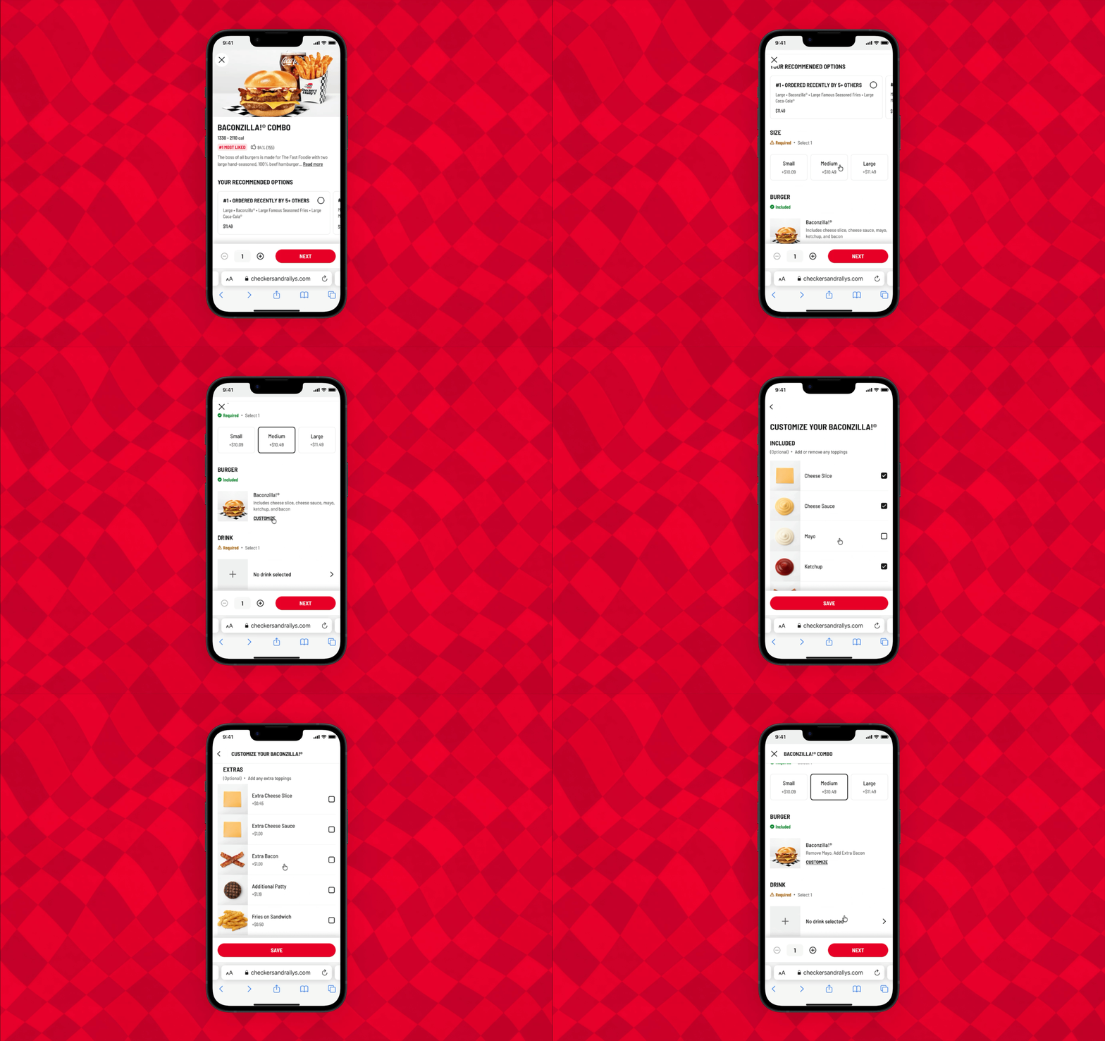
DoorDash Combo Experience
DoorDash powers custom online ordering platforms and native apps for enterprise merchants.
I redesigned the end-to-end combo meal ordering experience to simplify complex menu flows, improve visual clarity, and help customers confidently build and customize their meals.
Overview
The project
We redesigned the combo meal experience across DoorDash’s white-label web and native app platforms for enterprise merchants like Checkers & Rally’s, Capriotti’s, and Denny’s.
The goal was to simplify the combo experience to reduce friction, make choices clear, and help users confidently build their combo meals.
The team
I supported the Commerce Platform Team, which focuses on first-party, direct ordering and fulfillment products.
The team included product managers, engineers, UX designers, and a user researcher.
My role
I owned the product design work for this project, including redesigning the combo flow, adding visuals, improving copy, improving the menu architecture, and designing for both web and mobile.
Wireframing, user flows, interactive prototypes, user testing, A/B testing
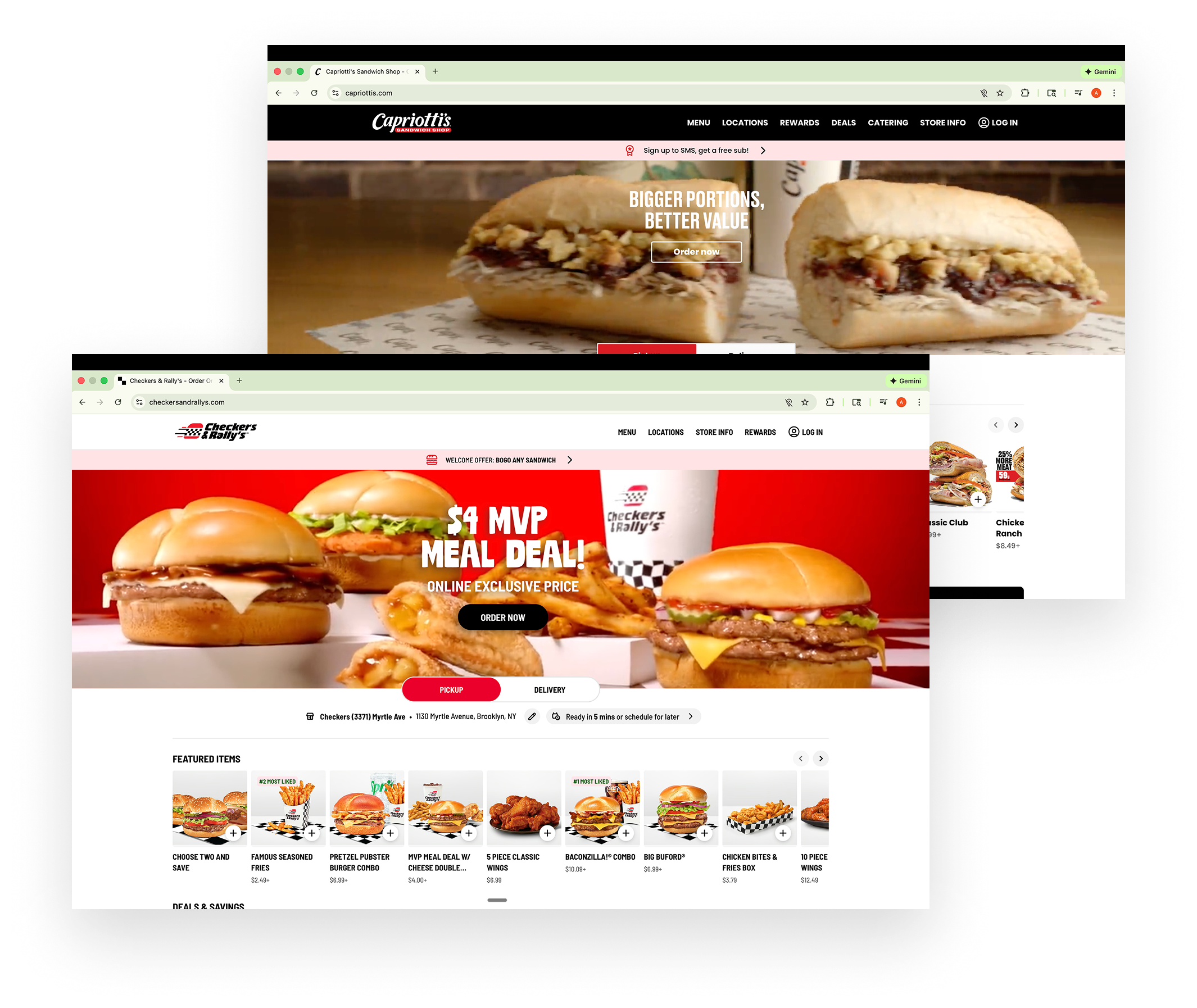
Online ordering pages for Checkers & Rally’s and Capriotti’s
The customer
Enterprise restaurant brands like Checkers & Rally’s and Capriotti’s use DoorDash-powered online ordering to sell directly to customers through their own branded websites.
These merchants rely on DoorDash to power the ordering experience and fulfill deliveries, and they depend on a low-friction ordering flow to convert hungry customers into completed orders.
The problem
Customers struggle with combo meal options due to excessive scrolling, context switching, and poor visibility of their selections, causing them to drop off before checkout.
Combo and meal builds drive a majority of total orders, but a significant portion of customers who open the item drop off before checkout. Even though combos are a better value, they convert worse than the individual items.
Customers tend to order food with their eyes. However, the combo pages lacked imagery and descriptions, which made it difficult for customers to evaluate their options.
Without seeing what’s included up front, they had to click into each item to see what’s included, adding friction and slowing decisions.
Unnecessary steps and jump screens
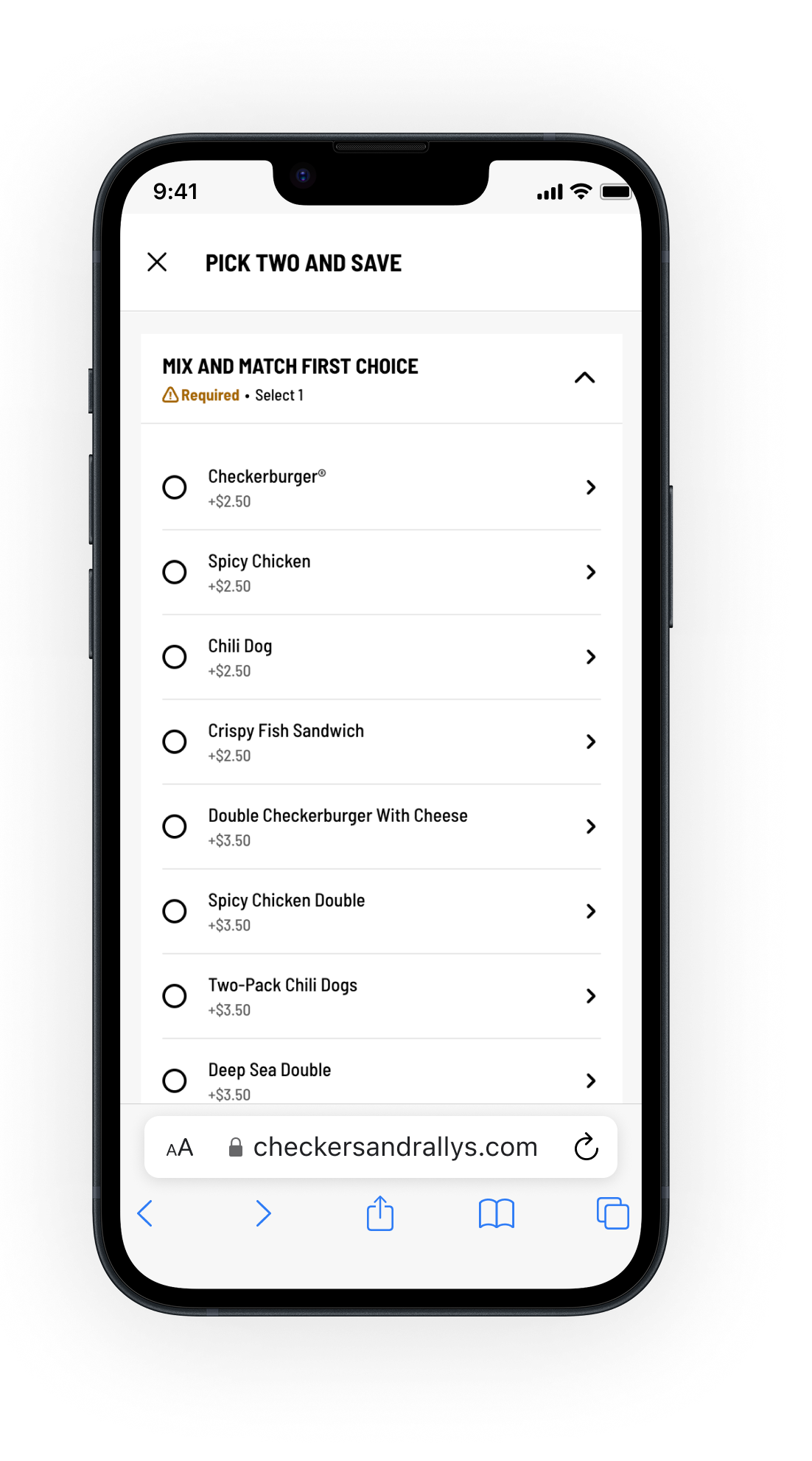
In the Checkers’ Pick Two and Save combo meal, customers had to select an entree option, which then opens a long list of burger options.
In the app, making selections opens a new screen each time, which makes it difficult to go back and review what’s been selected.
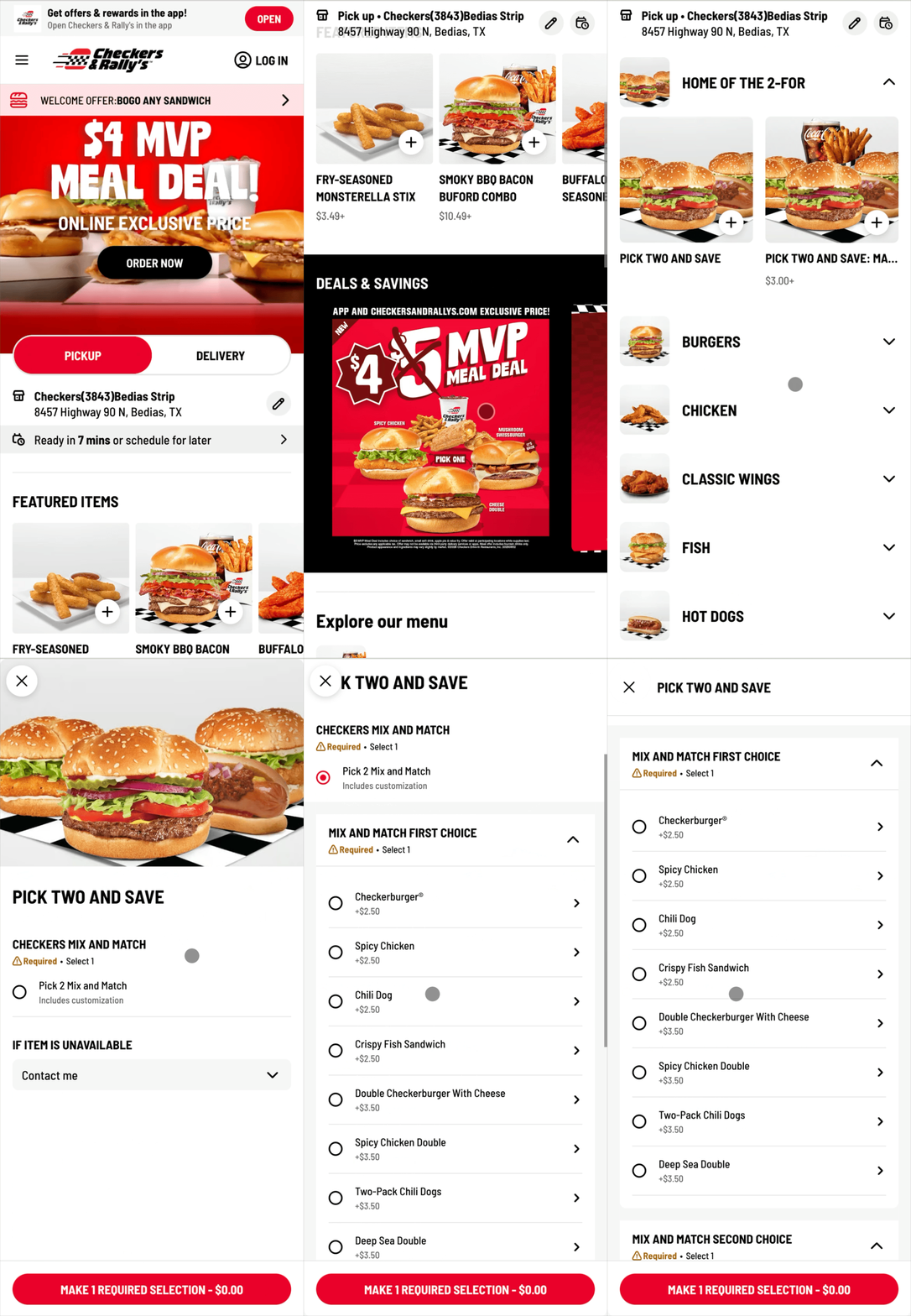
Ordering a Checkers “Pick 2 and save” combo meal
Disorienting dropdown menus and endless scrolling
When ordering a Duo from Capriotti’s, customers see a long list of sub options to scroll through, without any images to help them evaluate the options.
Selecting a sub then opens nested customizations in an accordion format, which pushes the unselected items above and below.
Users then have to scroll through the unselected subs, making it difficult to reach the next selections or go back and make changes.
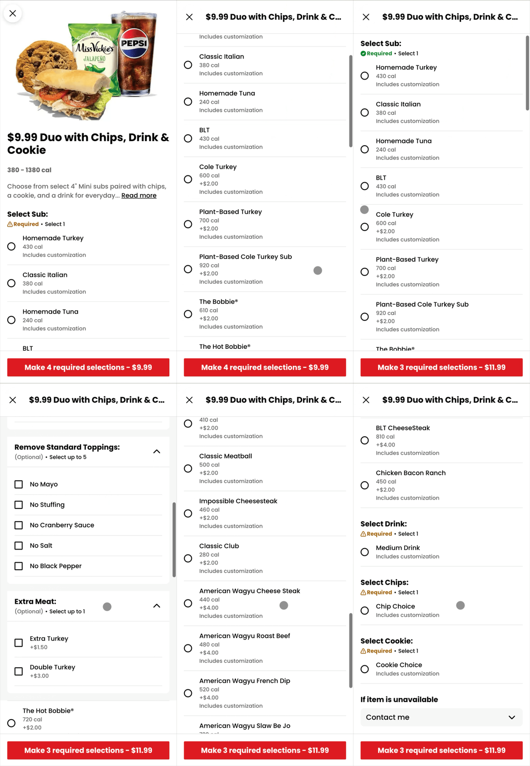
Ordering a Capriotti’s “Duo” combo meal
The hypothesis
By simplifying the combo experience to reduce friction, clarify choices, and provide clear imagery and visual feedback, users can more confidently complete their combo builds.
This will increase Combo Add-To-Cart Rate, improving overall checkout completion, and reducing cart drop-off.
Design principles
1 – Surface selections upfront
Show required selections on a main view so that customers immediately understand what they need to choose without navigating hidden steps.
2 – Image-first ordering
Replace text-heavy option lists with large food photography and clear visual feedback so customers can better evaluate their choices at a glance.
3 – Reduce cognitive overload
Remove disorienting accordions, endless scrolling and multi-screen jumps by capping long lists and using navigation cues.
4 – Design for scalability
Create a modular framework that can adapt seamlessly across any merchants’ menu combo models.
The solution
Because of the scope and complexity, the solution was a phased re-design strategy and broken into three milestones. This allowed us to ship incremental improvements, reduce risk, and validate assumptions along the way.
Phase 1 – Adding imagery
Added item imagery, improved navigating items, simplified the menu for easier scanning and selection.
Phase 2 – Upselling combos
Re-designed the combo upsell banner on the item pages to be more prominent, explained its value, and streamlined the upgrade flow.
Phase 3 – Combo experience
Centralized the combo flow, clarified required and optional selections, and made reviewing and editing easier.

Phase 1: Adding imagery
Image-first ordering
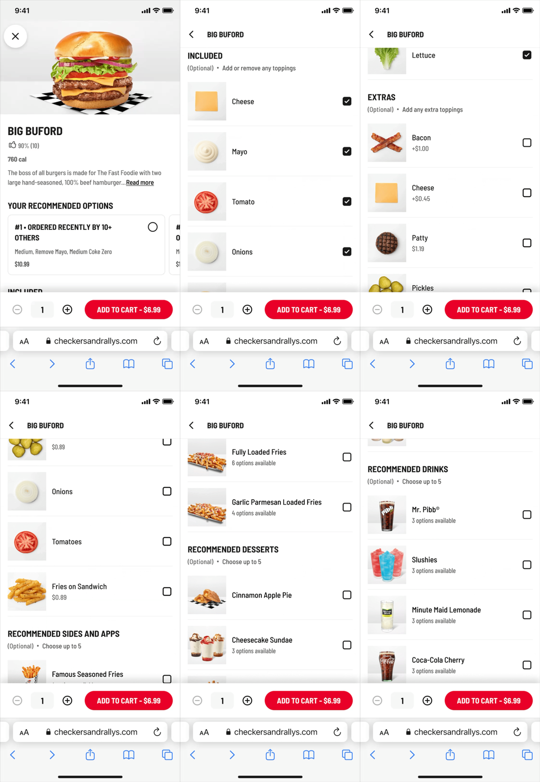
The first milestone focused on visual clarity. We added images where available and introduced neutral placeholders when images were missing, improving scanability and user confidence.
I also made UX improvements, such as moving the radio buttons to the right side closer to the thumb, cleaning up the menu to remove redundancy, and making adding or removing ingredients more intuitive.
Before
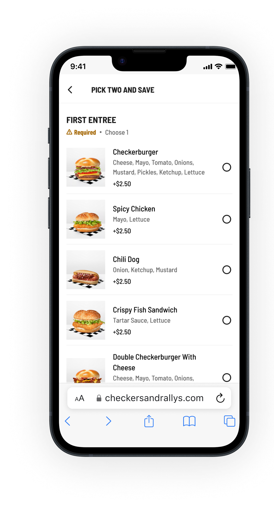

After
New item pages with images
Checkers item page
Capriotti’s item page
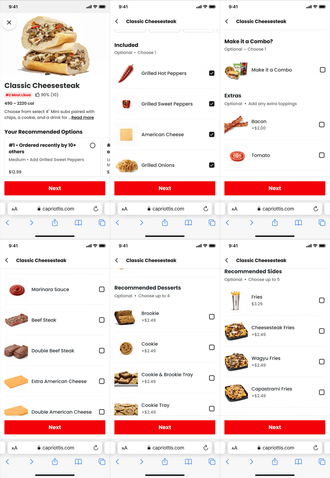
UX improvements to item pages
Clicking NEXT scrolls to the next incomplete required selection
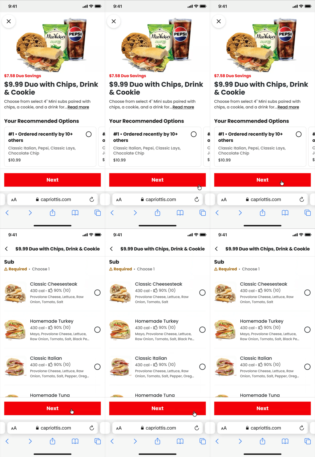
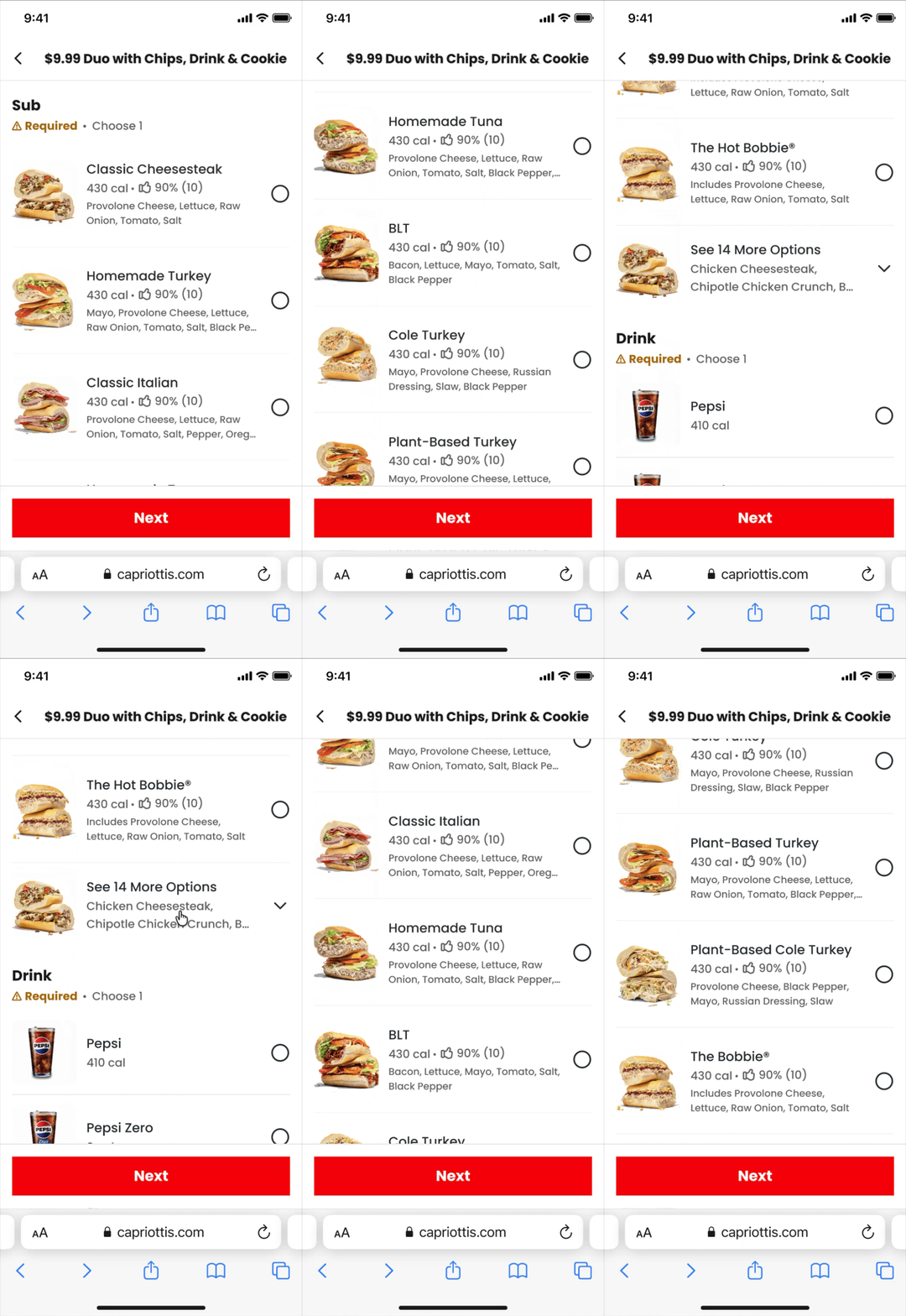
Truncate long lists. Show the most popular items and expand to show the rest
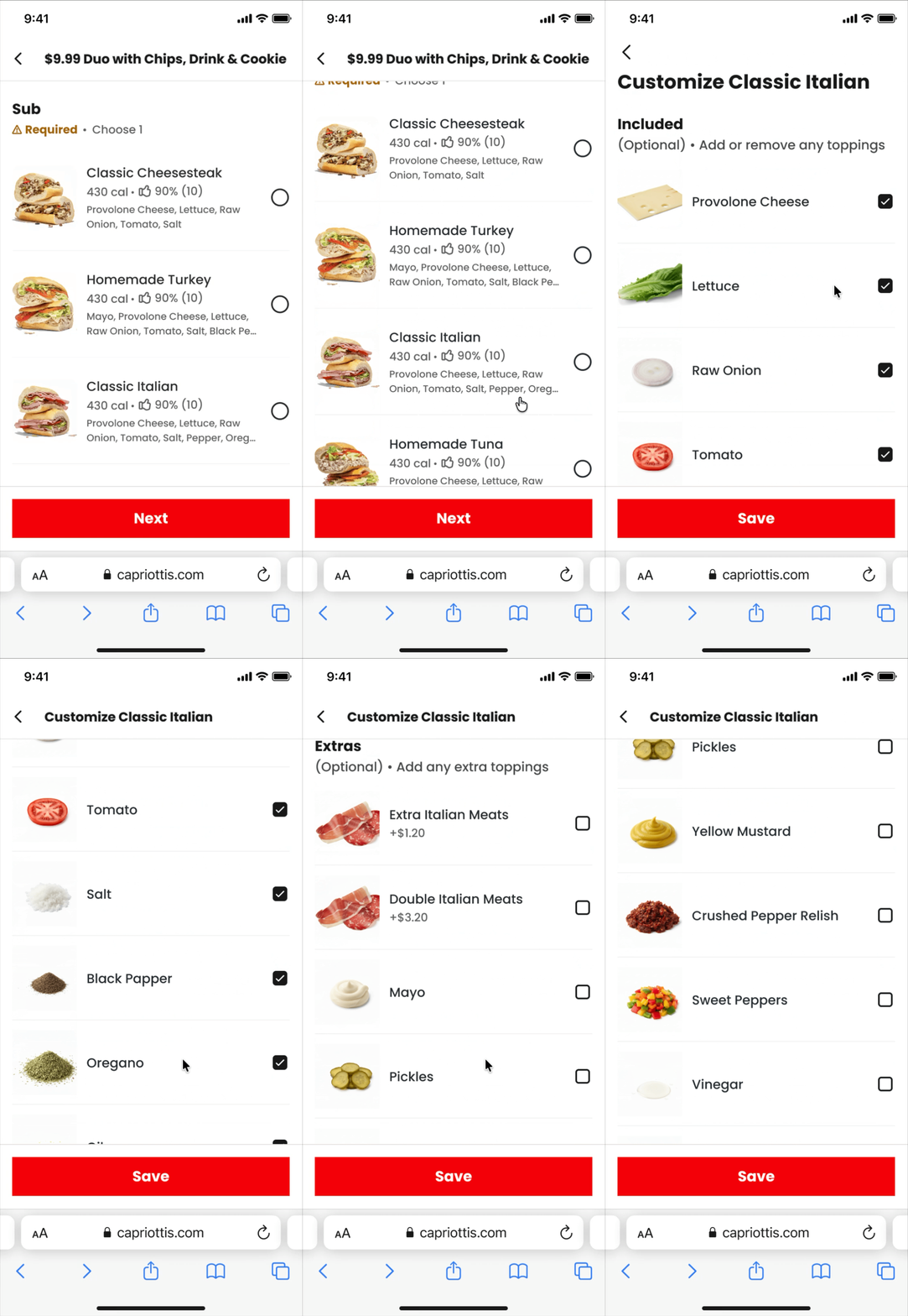
Customize on a separate page, rather than nested in accordion
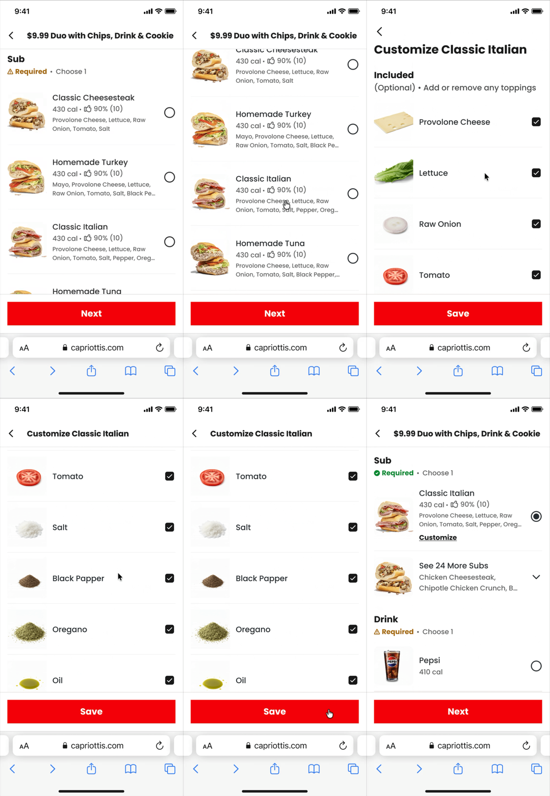
After selecting and customizing, truncate the unselected items, so easier to scroll
Phase 2: Upselling combos
Item page upgrade banners
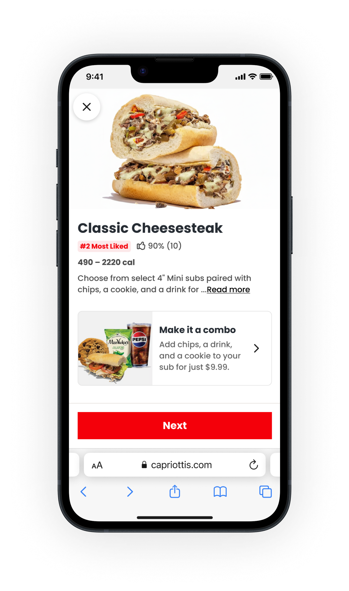
The second milestone focused on clearer combo upsells. Tapping on the combo upsell takes the customer to the combo page while remembering their sub and any customizations.
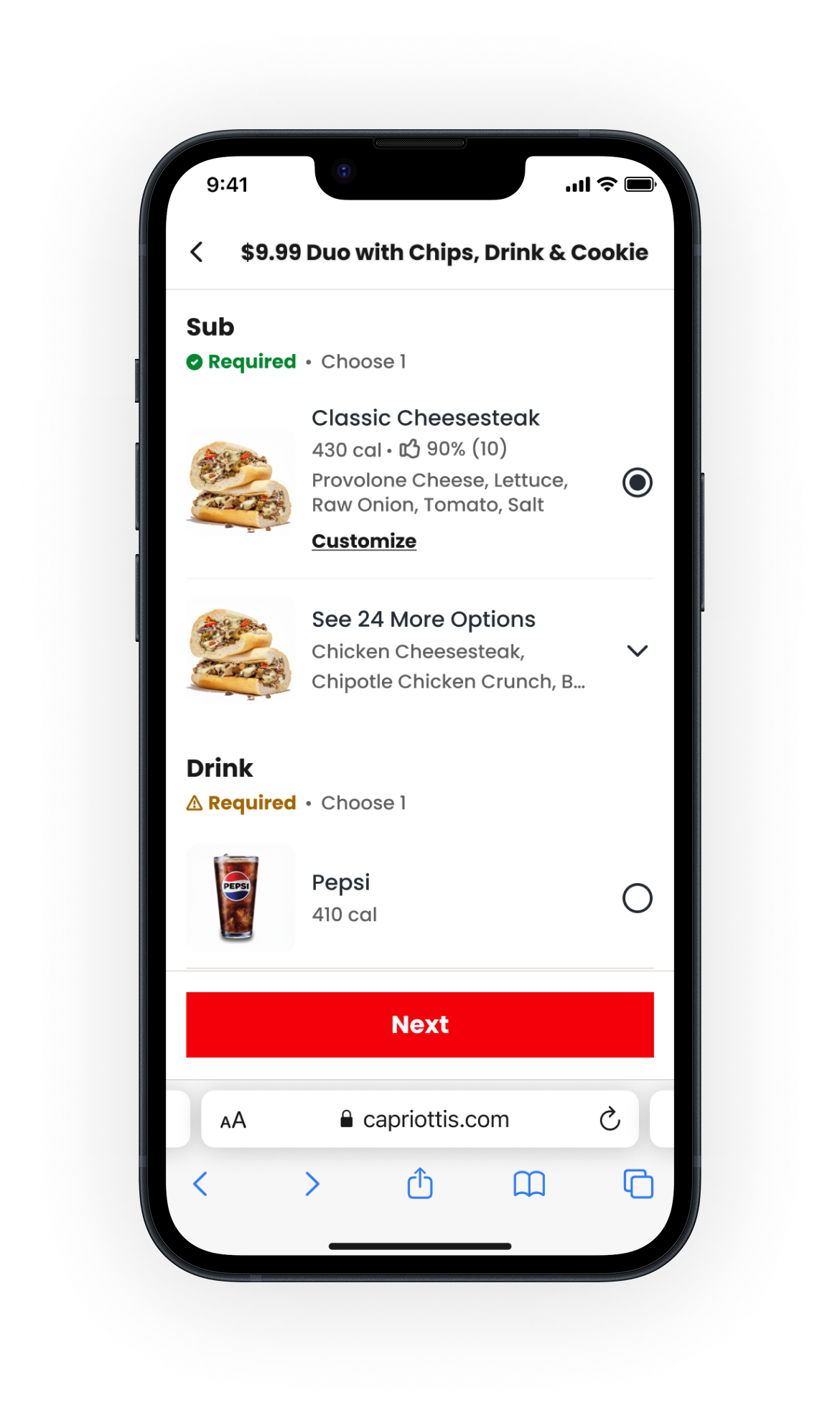
Classic Cheesesteak combo page

Classic Cheesesteak item page
Phase 3: Combo experience
Designing for enterprise scale
The final milestone rethought the combo flow based on our earlier system-level wireframes.
We designed a centralized combo experience, clarified required versus optional selections, and made it easier to review and edit choices from a single place.
The work needed to scale across merchants, platforms, and combo structures, while also remaining flexible enough to adapt to future enterprise needs.
Option 1
Long scroll
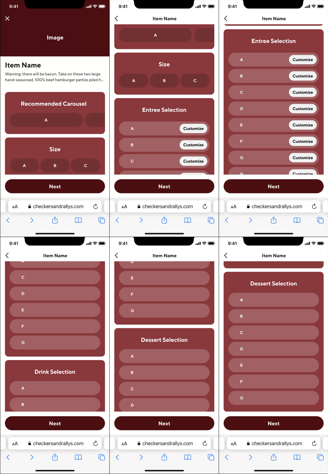
Option 2
Step by step
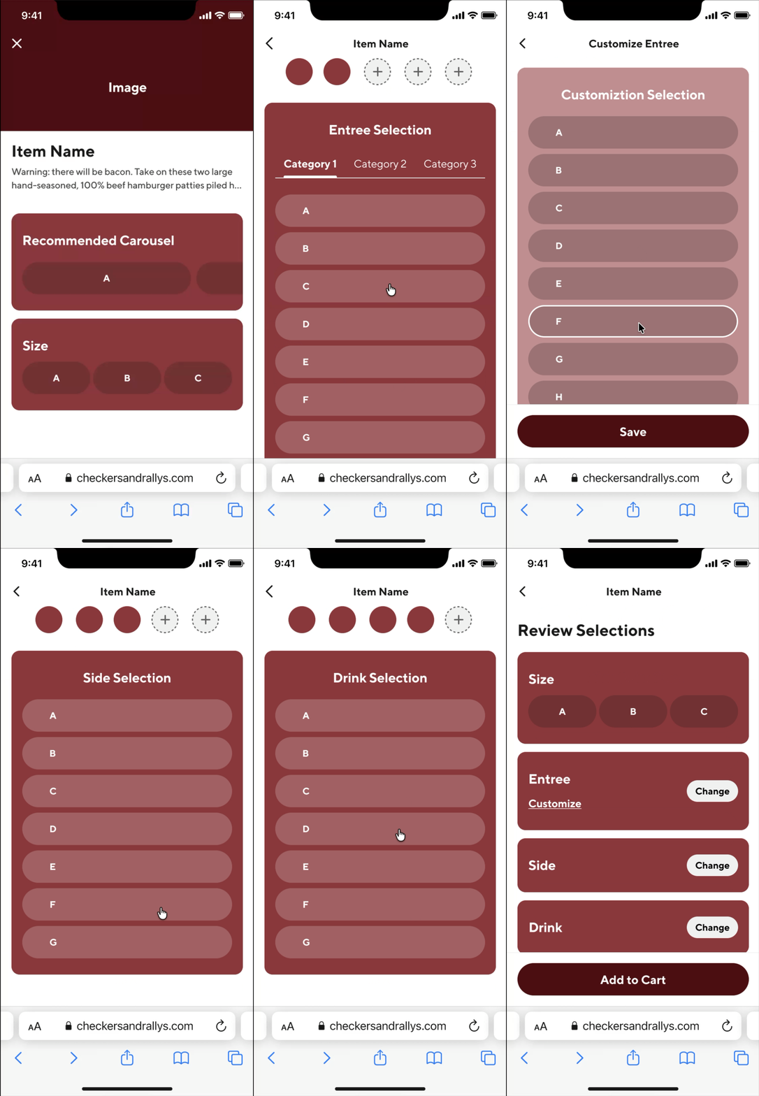
Option 3
Home view with tap to select
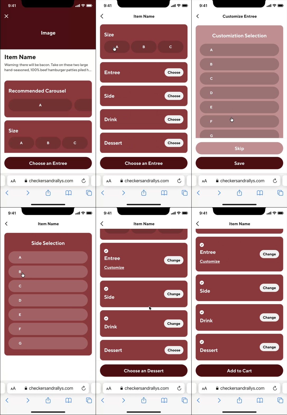

We decided to move forward with Option 3 because it provides users with a complete overview of the combo from the start.
Option 4
Home view + step by step
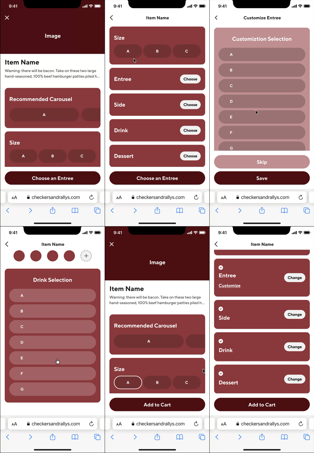
Flow for ordering a combo
The combo “home” experience surfaces all selections in one place. Required and optional items are clearly labeled, selections are visible at a glance, and users can easily edit choices without losing context.
Re-designed Caps Duo combo
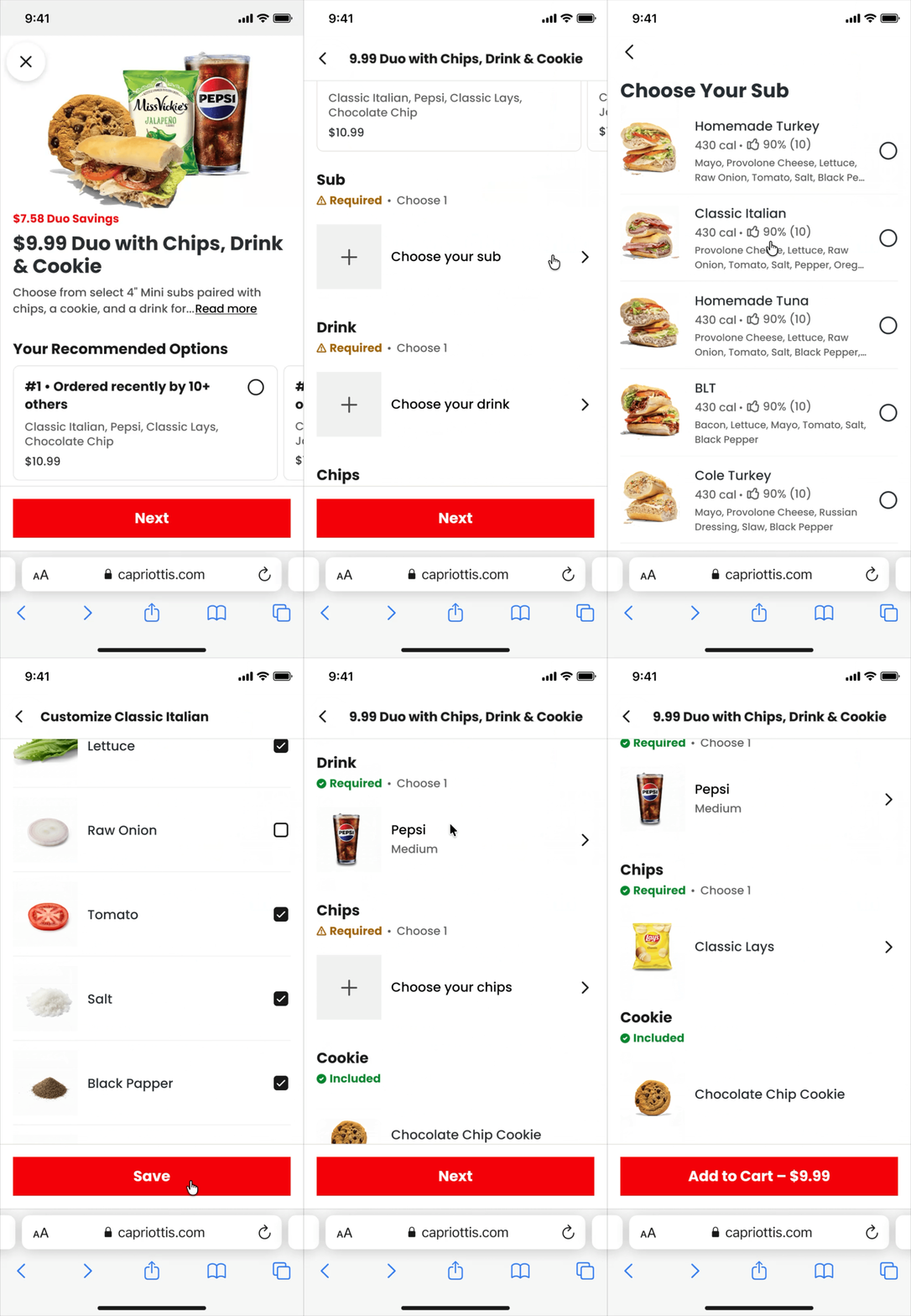
Combos experiment
We would launch the new combo design as an experiment to test whether combos should start empty or prefilled.
We hypothesized that pre-filling combos, either with popular items for new users or recent orders for returning users, would make it easier to complete a combo. Our primary success metrics were combo builds and add-to-cart actions.
First, we validated the designs through usability testing on Usertesting.com, focusing on how quickly users could complete a combo, how confident they felt, and where confusion still occurred. Overall, users found the new combo design easy to use.
Variant A
Empty State
Variant B
Filled State
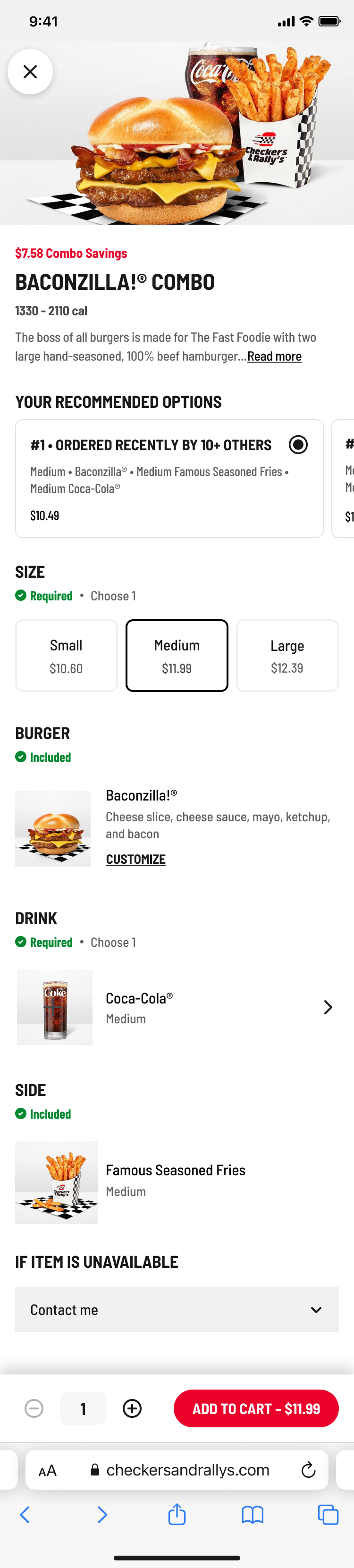
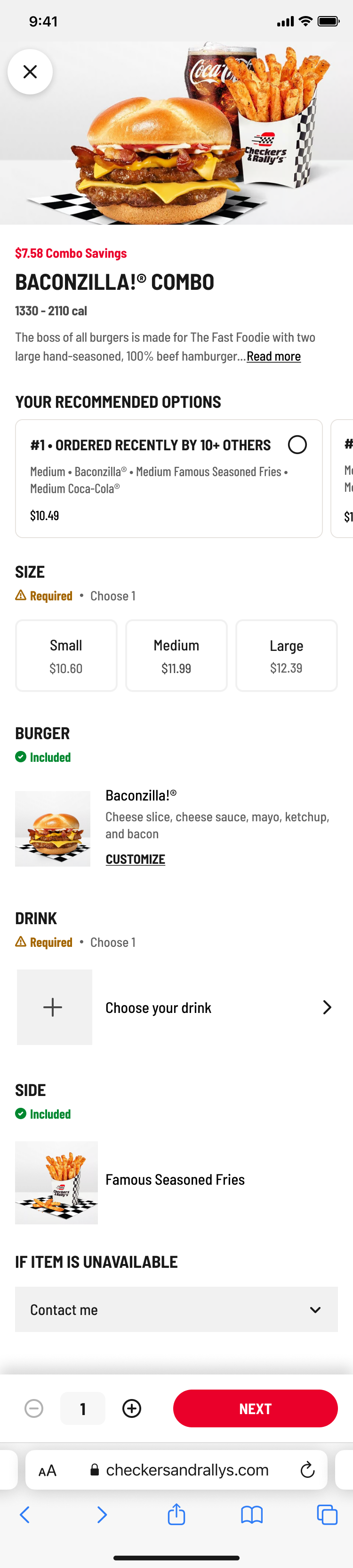
Designing for web, mobile app, and all combo types
The item page UX improvements and the combo experience needed to scale to all platforms, merchants, and combo types.
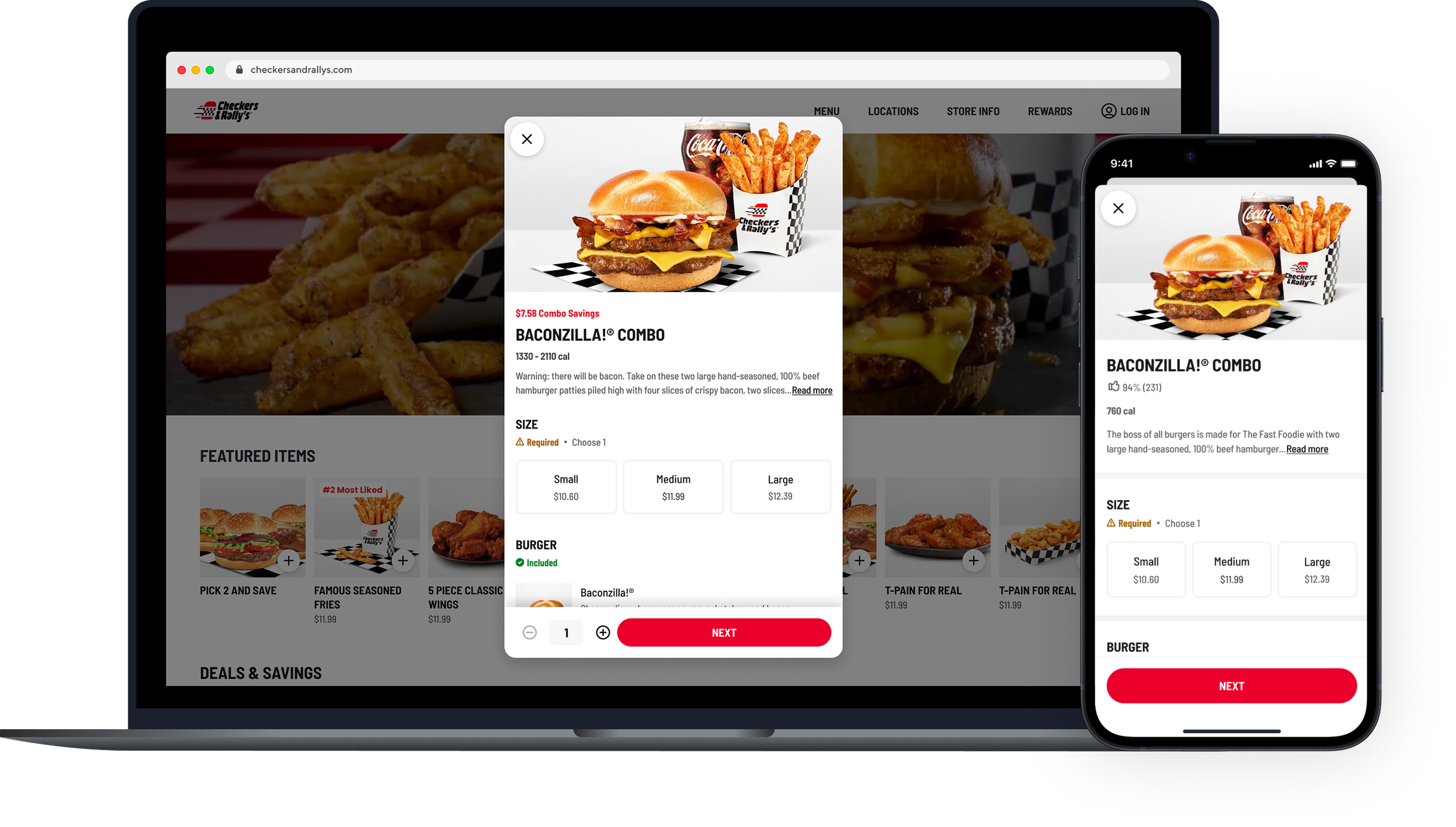
The redesigned combo experience is live today on Checkers & Rally’s and Capriotti’s, reflecting the item pages, imagery, and centralized combo flow. I concluded my contract before the redesign's post-launch performance data was available.
Prior to launch, usability testing on Usertesting.com validated the direction: users found the redesigned combo flow easy to understand and complete, directly addressing the original problem of customers abandoning combo items before checkout at a high rate. The final designs were handed to engineering for implementation across DoorDash's online ordering web and native app platforms.
Outcome